
I’ll probably make myself sound dumb in this post, since a lot of y’all are in more technical fields than I am. But I ran a crappy web design “company” when I was a kid and have sat through enough painful B2B SaaS A/B test meetings to feel at least 10% qualified to talk about this.
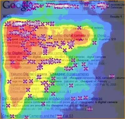
Back when I was trying to learn how to build a good website experience, I remember how often everything I read referenced heatmaps. In the wild west days of “the entire website is a Flash animation” and the CSS Zen Garden (I probably spent a full year trying to recreate 085), heat maps were really helpful in understanding how a user navigated your website.
As time has gone on and we’ve transitioned from animations to beveled buttons and back to flat buttons, some of the fun has gone away.
Back in the day, testing meant figuring out where to put the alien rendition of Vitruvian Man across the many sliced up .psds that make up your Giger-esque game site. These days, testing is more a too-many-cooks situation where the CEO and CRO argue for 3 hours over ‘Book a call’ vs. ‘Book a demo’.
The minimalism and aggressive optimization of the average website in 2026 isn’t necessarily a bad thing, though. We’ve gotten a lot better at making it easy to find the most commonly used parts of a page instead of burying them deep in a sitemap.
The vast majority of businesses out there aren’t selling anything particularly complicated or regulated and can get away with a pretty simple website that is easy to navigate. Unfortunately for financial institutions, they are not among that majority.
Every bank and credit union has a different offering of account types and customer segments they’re trying to serve. They’re also required to publish things like fee schedules and loan rates & disclosures.
The semi-public MS world talks a lot about probing and how important it is to find your own profitable avenues, but it can be pretty daunting at first. The average FI website is cumbersome, loaded with way too much info, and in the case of a CU I was probing the other day, may even be in literal plain text with a “coming soon” disclaimer at the top.
As with most things in life, trial and error and building your experience up will help you start to understand which FIs might be worth digging a bit deeper on, while also helping you save time by crossing off the ones with no angle.
There are some obvious places to start – pretty much anyone could tell you that the credit card comparison page is a good place to start your probing, and it is. But it’s harder and harder to find that unicorn card for a specific category, and you’ll start to recognize the uninspiring Elan portfolio across a wide range of FIs.
There are some other places on a FI website that can serve as useful clues as to whether you’ve found a hit or a dud.
If I was a beginner at this and trying to learn, I’d incorporate the heatmap idea and how it has evolved over the years. What does a FI want to make easy for their customers to find on their website?
Not all of them are good at it (which can be a good sign, actually), but some of them make it very easy to find the CTA you’re truly looking for. And finding that CTA can save you a lot of time in the probing process.
Hope this helps and that you find something interesting where you “live, work, or worship”.
Singgitan!

Sometimes a bank will really make it hard to discern the value prop, but other times it’s right there in front of you